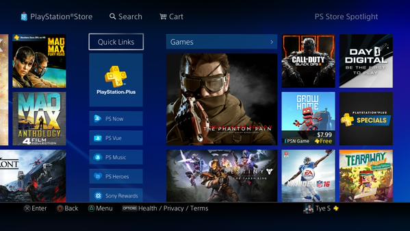
For PS4 gamers living in North America, you may have noticed the PlayStation Store looks a little different as of today.
As you can see from the picture above (via @PSPersuasion), the PlayStation Store has had a makeover. It looks cleaner and better than before.
The design looks similar to that of the Xbox One’s store as it has lots of boxes. Hopefully this new design means the PlayStation Store takes a faster time to load and is more responsive.
The store still looks the same in New Zealand so PAL territories have the old design. It’s possible the new look is coming in waves and other countries will get it eventually later this month.
The new design does make the store look cleaner and easier to navigate. It reminds me of the original look of the store when the PS3 first launched. I always preferred that look until Sony decided to change it a few years later.
Hopefully now the PlayStation Store will be easier to find things. Reception for the new design has been positive so far so that’s a good start. It’s likely the new store design is coming in preparation for the new 3.00 update that was just announced.


Published: Sep 2, 2015 06:38 am