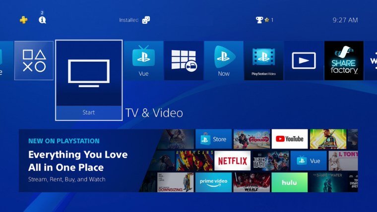
UI’s are always the trickiest part of a console. Some people love them while others hate them and the arguments never seem to stop about how to improve them. The PS4 has maintained the same UI since it launched a few years ago and while the core experience will remain the same a new PS4 update will be changing the TV & Video UI around quite a bit. The update is rolling out today so if you’re a big media user of the PS4 check it out and let us know what you think in the comments below.
“The new design puts content front and center, making it easier for you to discover and watch the best movies and TV shows available across your favorite streaming services, such as Netflix, Prime Video, Hulu, and YouTube, in addition to PlayStation Video and PlayStation Vue,” explains Sony’s announcement.
The focus of this UI overhaul seems to be simplifying the experience. Bringing all the TV and video content together into one place and letting users browse it as they wish. It’s a bold move from Sony and hopefully it results in more people who prefer the interface to those that dislike it. We’ve seen some updates in the past that divided the community even more, especially over on the Xbox One.


Published: Mar 29, 2018 02:46 pm