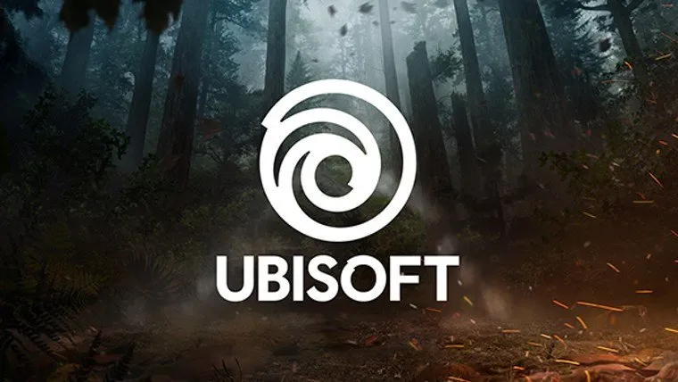
Ubisoft’s swirl logo is one of the most iconic in all of gaming. Alongside Nintendo’s, PlayStation’s, Xbox’s, EA’s, and Activision’s branding, Ubisoft stands out with a cool looking logo that evokes memories of the company’s games. Now they’re shaking things up, keeping things similar, but debuting a brand new swirl style logo, which can be seen above.
“The new swirl is an evolution of our existing logo that marks a new era for Ubisoft, one with an increased focus on live and digital games as well as a player-centric approach to creating immersive worlds,” reads the announcement.
Ubisoft explained the change by laying out their history, and how their logo has been evolving over the years. The current logo debuted in 2003 alongside the acquisition of Red Storm, and the launch of new Tom Clancy games. Before that Ubisoft mostly displayed their name with its own styling, without a standout image.
“Today, we create worlds – worlds that live as video games, comics, movies, TV shows, books, and amusement park rides. Our new logo is minimalist, modern and monochromatic. It’s a window into our worlds, giving a preview of what’s to come by highlighting the artistry that goes into creating them. The swirl and the letter O are both deliberately created to be reminiscent of hand-drawn shapes and represent our human qualities of enthusiasm, curiosity and the grain de folie that Ubisoft is known for.”









Published: May 31, 2017 11:46 am