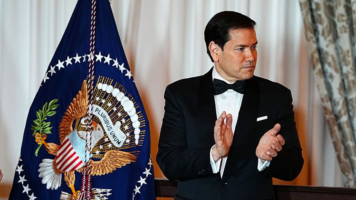
Secretary of State Marco Rubio has told the State Department to stop using the Calibri font and go back to Times New Roman for all official documents. This change is part of the government’s fight against what they call “woke” policies.
According to The Independent, the order says diplomats must use the older font to bring back “decorum and professionalism” and to get rid of “another wasteful DEIA program.” But people are confused about how a font has anything to do with Diversity, Equity, and Inclusion programs.
The decision has caused a lot of confusion online. Many people can’t understand why changing a font is connected to fighting political ideas. One person wrote, “How in the hell is the Calibri font ‘DEIA?'” and called the whole thing “petty nonsense.”
The font change is part of Trump’s bigger war on diversity programs
This move fits into President Trump’s larger effort to remove diversity programs from the federal government, which he calls “pervasive and destructive.” The font switch has become a surprising part of that bigger fight.
The State Department is defending the decision. A spokesperson said the new font rule “aligns with the President’s One Voice for America’s Foreign Relations directive.” They want all department communications to look unified and professional. The department has been issuing controversial directives about employee job duties as part of this wider push.
The department also pointed out that serif fonts like Times New Roman are standard in many powerful places. Courts, legislatures, and other federal agencies use these fonts because they show “permanence and authority.” Serif fonts have those small decorative lines on the letters, and they’ve been getting more popular lately.
Calibri was chosen in 2023 by former Secretary of State Antony Blinken. He picked it because the simpler, cleaner design made it easier for people with visual disabilities to read. Some studies have backed up this claim, which means going back to Times New Roman could be harder for some staffers. The administration has faced similar transparency concerns, with lawmakers pushing for access to withheld information in other areas.
Some welcomed the change on social media. “How in the hell is the Calibri font ‘DEIA?’” one person wrote. Others, however, ridiculed the move. “This was actually an issue, lol?”: one person wrote.
Times New Roman was the required font from 2004 to 2023, but before that, diplomats had to use Courier New. That font was seen as very modern back in the early 1960s. Font trends have really changed over the years, and now they’ve changed again.


Published: Dec 10, 2025 04:45 pm