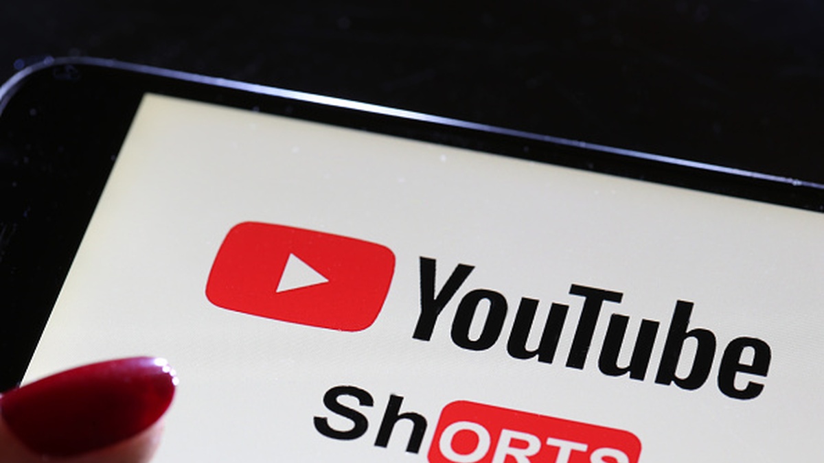
YouTube users have long been divided over the platform’s Shorts feature. While many enjoy discovering new creators and content through quick, swipeable videos, others would prefer Shorts to exist as a separate app altogether. Now, even some fans of the format are running into confusion following a recent design change to the Shorts interface.
The Shorts layout has traditionally been kept deliberately simple, with all of the main interaction tools lined up neatly along the right side of the screen. According Android Police, more secondary options are tucked away behind a three-dot menu to avoid clutter. In the familiar design, the like button sits at the top, followed by the dislike button, comments, sharing, remix options and the creator’s channel icon.
However, some users have noticed that the dislike button has vanished from its usual position. This has led to speculation online that YouTube may have removed the feature entirely, sparking frustration and debate among viewers who rely on it to quickly signal their feedback.
YouTube is making it harder to express negative feedback
In reality, the dislike button has not been removed. Instead, YouTube has quietly moved it to a different location as part of an interface tweak. The change appears to be part of an ongoing experiment with Shorts’ design, but the lack of clear communication has left many users puzzled and searching for a feature they were accustomed to seeing in the same place.
YouTube confirmed the change in a new support post. The dislike button used to be a simple one-tap icon on the right side. Now it’s buried inside the three-dot overflow menu. To dislike a video now, users must tap the three-dot menu on the top right, then find and tap the dislike option.
YouTube also announced it’s merging the dislike and “Not interested” buttons. The company says users treat these buttons the same way anyway. Some viewers will see the thumbs down icon labeled as “Dislike” while others will see “Not Interested.” Everyone who clicks the thumbs down will get an optional feedback survey, similar to how “Not Interested” currently works. The platform has been making several updates lately, including winning exclusive rights to major TV events.
This change appears to be a test, not a full rollout. Some users still have the dislike button in the main sidebar on both Android and iOS across multiple accounts. However, many users are seeing the new version.
The change creates extra steps for users trying to leave negative feedback. This extra work will likely frustrate Shorts users. YouTube tried something similar last year by moving the dislike button to the overflow menu, but that change didn’t last. Whether this version stays remains unclear. While YouTube continues testing interface changes on mobile, the company recently rolled out significant improvements for TV users.


Published: Dec 20, 2025 04:15 pm