During Microsoft’s Build 2017 address in Washington, the company revealed what is their new design philosophy when it comes to UI. It’s something they’re calling Fluent Design, and it’s coming to the next major Windows 10 update called the “Fall Creators Update.”
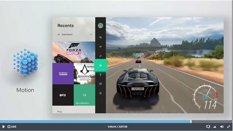
This fluent design system was revealed in a video alongside the keynote, one which touches a number of different interfaces that Microsoft works with, so not just the Xbox brand. However, the images shown in the video and presentation revealed a new type of dashboard which was seemingly for the Xbox or Xbox Scorpio as you could clearly see current aspects of the Xbox dashboard on display.
While this is probably just a concept of what the finished product looks like, you can clearly see in the video that this is something that is currently working in some capacity. Come fall, this very well could be the dashboard we are looking at when playing on the Xbox One or the Xbox Scorpio.
The translucent nature of the design and ease of access to pinned items and other key features of the core functions of the console could be a huge boost for the Scorpio or Xbox One S. One of the major flaws of the Xbox One has been in the UI, with Microsoft changing it constantly since the console launched in 2017.
Hopefully with Scorpio on the horizon, they’ll get it right this time, the first time. This also likely won’t affect just the Xbox Scorpio as if this was to be implemented for the new console you could expect that the Xbox One would get this upgrade as well.
Fluent Design Xbox
https://youtu.be/vcBGj4R7Fo0


Published: May 11, 2017 12:07 pm