



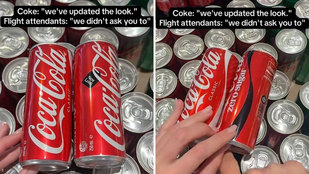

The Coca-Cola Company rolled out revamped product designs internationally in July, but the new look for Coke Zero is confusing consumers and service workers alike. While the company aimed for a more unified aesthetic, the design shift has made the zero-sugar version look strikingly similar to the classic red can, as reported by BroBible.
Melbourne flight attendant Ava, who posted a video on TikTok, highlighted the issue. She showed how easy it is to mix them up, since they feature the same Coca-Cola logo people have recognized for decades. To the casual observer, the two cans appear nearly identical at first glance. Coke Zero previously came in a red can with a black logo.
In her video, the side of the new can facing the camera shows only a small black design that reads “new look.” The Zero Sugar marking and black ribbon design only come into view once she rotates the can, which slows down crew trying to provide quick service.
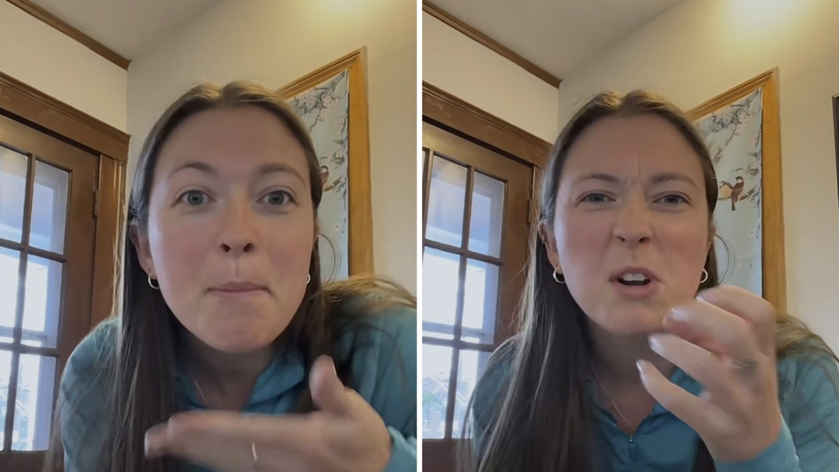
Ava says she keeps handing passengers the wrong Coke
Ava admitted that the redesign is actively making her job more difficult during flights. In the caption of her video, she wrote, “Lost count of how many wrong Cokes I’ve handed out this week.” Ava was not the only person making the mistake, as another commenter said they had already done the same.
The Coca-Cola Company says the overhaul is meant to create a more cohesive brand experience across more than 200 markets. Rapha Abreu, the company’s global vice president of design, said in the press release that a single visual identity lets it deliver a recognizable brand experience to consumers.
The announcement says Coke Zero keeps its own visual cues, listing larger Zero Sugar text, a black ribbon on cans, and a black cap on plastic bottles. However, Ava’s video shows the ribbon and text sitting on one side of the can, as the other side carries only the logo and the “new look” design.
The company has also given caffeine-free drinks a golden logo and flavored fruit beverages their own designs. The new cans are rolling out across Europe, Asia, Latin America, and the Middle East, so more Coke Zero drinkers should encounter them in the coming months.





Published: Oct 7, 2026 02:45 pm