Excited gamers awaiting the Doom reboot were given a snippet of what to expect when Bethesda and ID Studios announced a release date of May 16th, alongside a trailer which can be viewed here. Unfortunately, fans expectations for the subsequent cover art have not been met, and the reaction upon it’s release has not been as positive as previous aspects of the campaign.
General reaction to the campaign trailer has been positive, with hints of the original classic showing through in the forms of well known enemies such as Cacodemons and the Barons of Hell. We would have been forgiven for expecting the cover art to be more of the same nostalgia inducing, but with something fresh to reinstate Doom as the original trailblazer amongst other FPS titles.
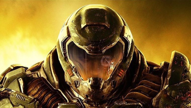
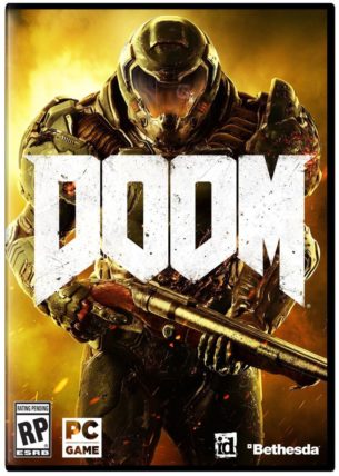
If you haven’t seen the original Doom art, and we aren’t judging(much), here it is. However, the new cover art, seen on the right, shows a heavily armoured space marine holding a gun on a yellow background, and is a far cry from the hand drawn iconic art we saw in 1993.
Unsurprisingly, the response was less than overwhelming with the cover deemed ‘too generic’. A NEOGAF contributor even removed the ‘DOOM’ title and replaced it with other first person shooters – ouch. Other users have added that they are less inclined to buy a physical copy of the game, showing that a good cover is an important part of their experience.
We will have to wait for the game to hit the shelves before we know if there is any actual impact, but in the meantime let us know your thoughts!





Published: Feb 8, 2016 03:00 pm