The scale of the Pokemon Universe means there are now one thousand species to love and meet during any trainer’s adventure. Of course, you’ll fall in love with the fiery fox Vulpix or the elementally affected Eevee, or even have a special place in your heart for the charms of Lechonk, but have you ever seen a Pokemon you feel physically repulsed by? Out of over 1000 species, there are bound to be some runts of the litter, and the Pokemon community has been quick to share their distaste for the design of quite a few. So we’ve compiled a list of some of the ugliest Pokemon for your enjoyment.
What Makes an Ugly Pokemon?
Throughout the adventure of a Pokemon trainer, the preference of which Pokemon belong in a party while others are willfully sent to boxes is part of the adventure. If you’re set on catching them all, you’ll have to meet quite a few unsavory characters to earn yourself a coveted Shiny Charm. While there is nothing to set ugly Pokemon apart characteristically, there are a few repeat patterns, such as overly large features, garish color palettes, or generally unsettling energies, so when it comes to narrowing down the ugliest ducklings, there is a pretty solid consensus. The list below shows our top ten least favorite Pokemon designs, and hopefully, you can see our reasoning.
10. Alolan Muk
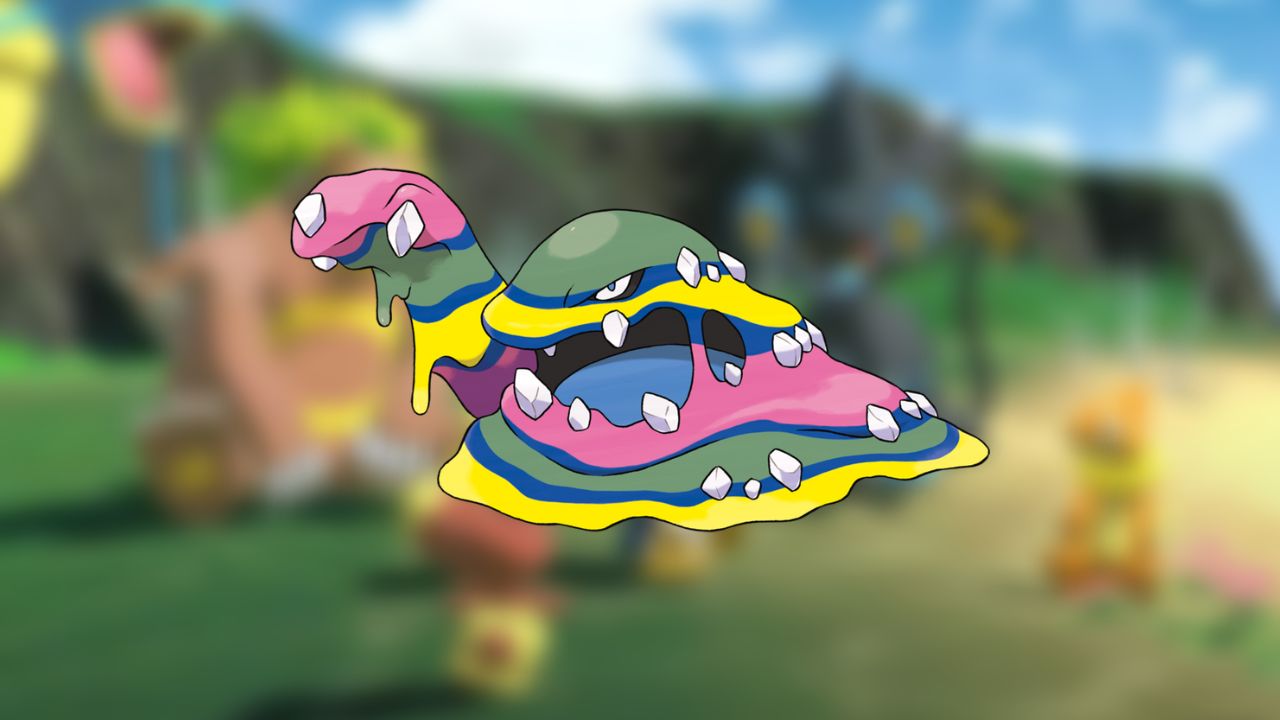
The standard design for Muk and Grimer are designed to be repulsive, but their purple sludge-like bodies have warmed the hearts of trainers over the years. That being said, there’s something about Alolan Grimer and Alolan Muk which is truly horrendous. It has the same form as the standard Muk, but the color sets it apart, which is one of the reasons it’s become one of the ugliest Pokemon.
9. Bruxish
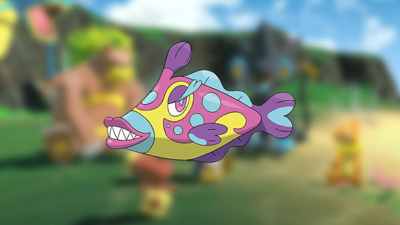
Bruxish is a perfect example of a garish color palette paired with horrendous features, resulting in an awful design and much-hated Pokemon. Its colossal mouth, sharp fangs, and weirdly human eyes have put trainers off ever including it in a party since Generation 7, so it’s safe to say this Pokemon is captured and immediately sent to boxes to avoid ever looking at again.
8. Jynx
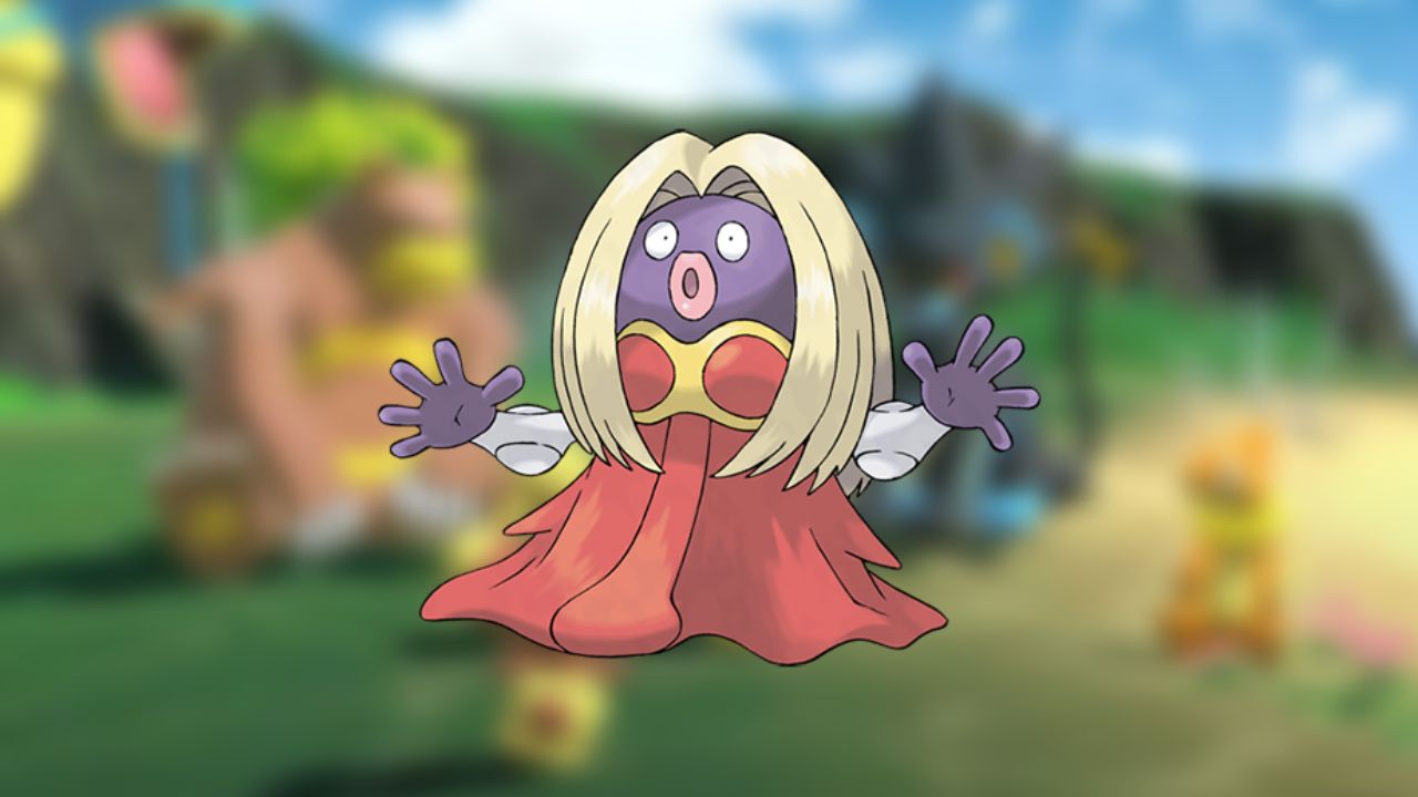
There isn’t a whole lot of reasoning behind the communal dislike for Jynx, but it’s been as solid as generation one and shows no signs of leaving any time soon. As one of the only humanoid Pokemon, this species is more unsettling than it is ugly, and there’s something about it that you wouldn’t want to face in real life. Paired with Mr. Mime, the Pokemon community could probably say enough about why they dislike them to fill an entire list. Plus, it doesn’t help that the pre-evolution Pokemon, Smoochum is pretty cute.
7. Mr. Mime
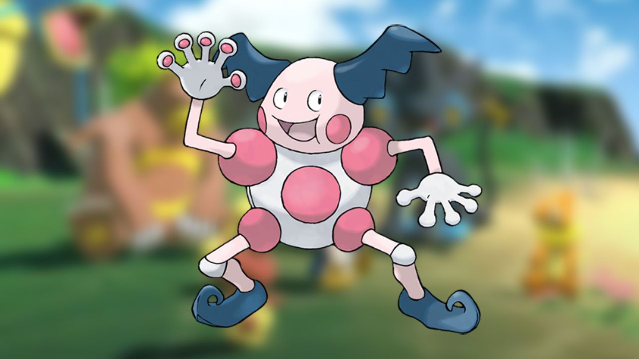
Much like Jynx, Mr. Mime is one of the most, if not the top spot, for unsettling Pokemon designs. Its humanoid features and mass of gestures are somewhat intimidating, and it’s not a Pokemon you’d want to meet in a dark alleyway. Since it’s been around since Generation One, there’s been ample time for trainers to share their distaste for this Pokemon, and once again, it doesn’t show any signs of fizzling out.
6. Dracovish
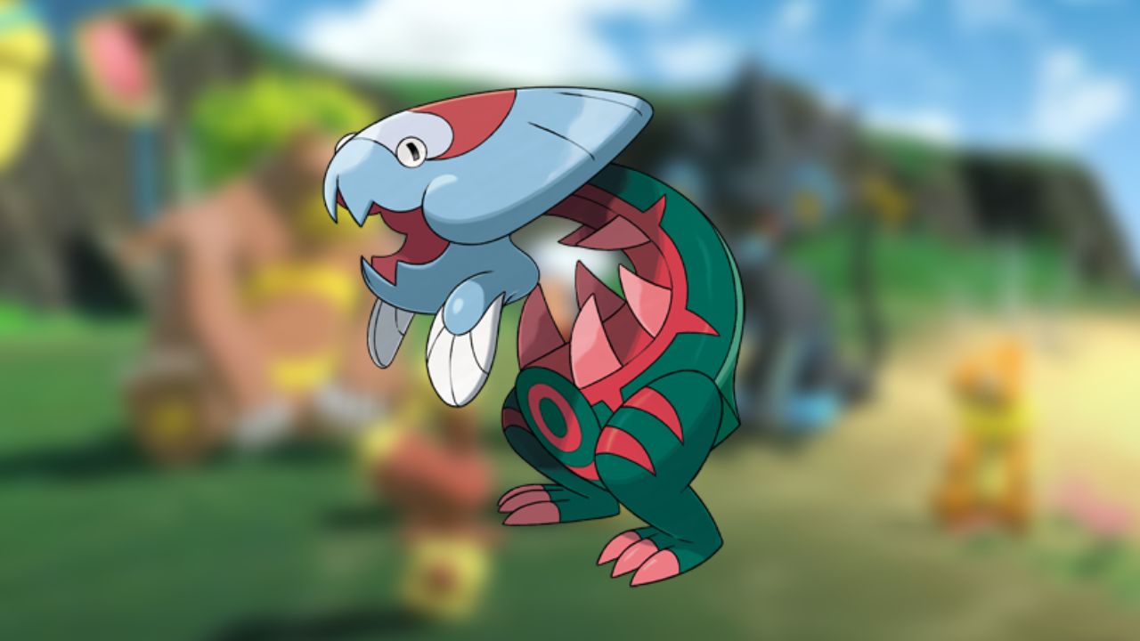
Taking the form of two fossils fused, Dracovish is one of the more unusual additions to the list, but there’s a good reason it’s landed a spot. Between its large head and strange body, Dracovish looks like it was jammed together as part of a science experiment. It is disappointing, considering there are so many well-designed fossil and dinosaur Pokemon already. It’s not a Pokemon you’d jump at the chance to catch, so unfortunately, it’s got a place on our list.
5. Alolan Raticate
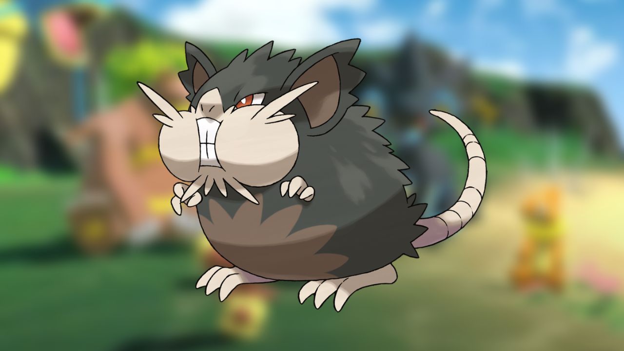
The standard Radicate design isn’t perfect, but the Alolan variation and its inflated cheeks are enough to land a spot on the list of unappealing Pokemon designs. That said, at least Raticate was designed to be an intimidating and unsettling Pokemon in generation one, yet it became pretty iconic for trainers stuck in the tall grass. It’s a shame the design of Alolan Raticate became so rounded rather than maintaining its rat shape.
4. Feebas
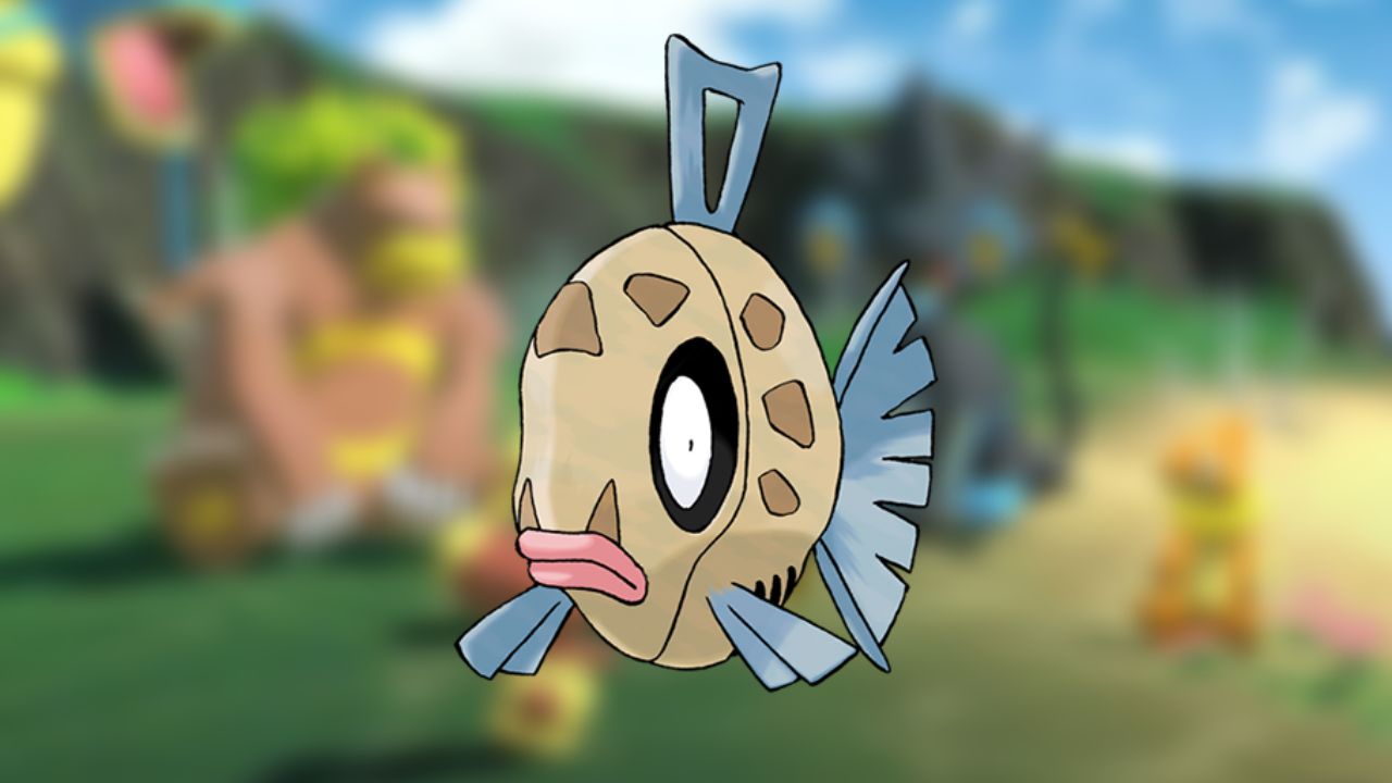
Feebas is designed as if all the color was drained from Magikarp, leaving you with what remains of a fish body. Although it’s not as useless as Magikarp initially and learns a few more attack-based moves, that doesn’t make it a nice Pokemon to look at. The only reason trainers will keep this Pokemon in their party is because of how powerful and pleasant Milotic is, which outshines Feebas massively.
3. Garbodor
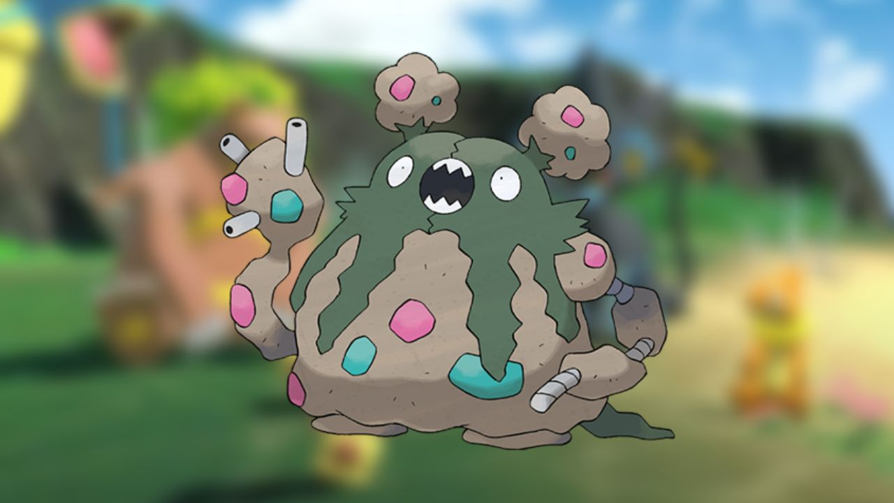
What else can you expect from a Pokemon designed from trash? But, at least Garbodor takes its appearance in its stride, and there’s no debate on whether it’s oddly charming or just a horror of a design. Instead, everyone just knows that Garbodor is not a go-to travel companion and instead is more of a tank when your team needs to take a few more hits.
2. Barbaracle
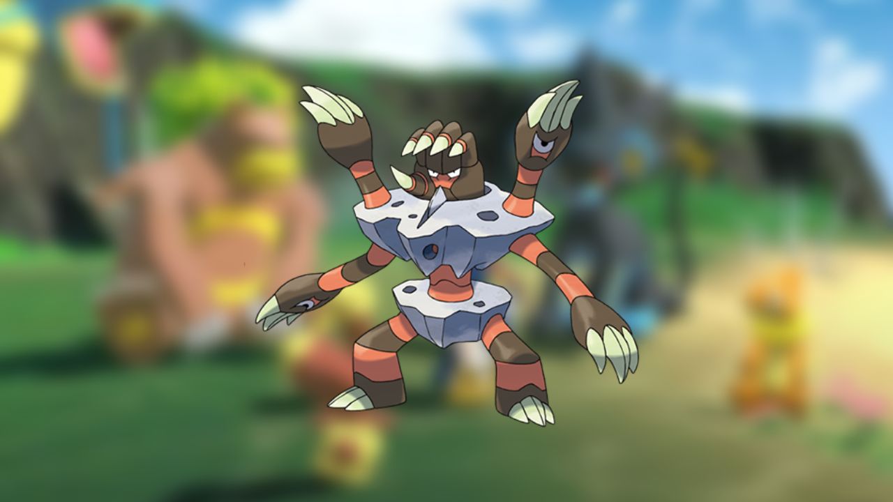
There is a lot to dislike about the design of Barbaracle, be it the face on a hand or the weird holes throughout the body where limbs miraculously sprout from. Each palm has an eye, so you know it’s watching your every move, so to be on the safe side of their weird garden eel-Esque creature, maybe catch it and stick it straight into a box.
1. Gurdurr
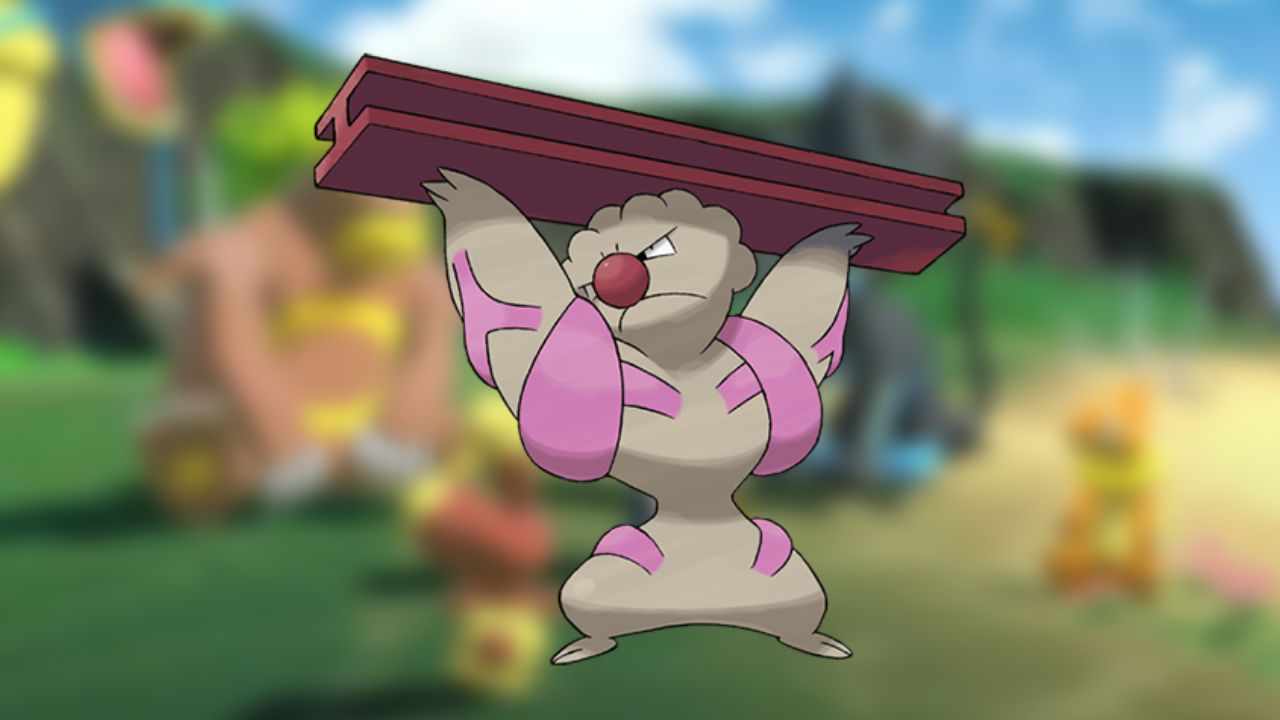
Although we’d argue that Gurdurr is one of the ugliest Pokemon designs, it’s also forgettable. Described as the “muscular Pokemon,” the pink stripes are designed to look like veins, which makes it uncomfortable to look at. In addition, the head and nose of give it a clown-like appearance, which is fitting considering how laughable the design is.




Published: Jan 24, 2023 05:57 am